
This post looks at an application of cognitive psychology to the "Neihan Duanzi" app (a ByteDance joke-and-meme app; a little plug for my company's product).
The Neihan Duanzi operations team keeps getting user feedback asking "Does Neihan Duanzi have a favorites feature?", so much of it that you can't help wondering: why can't so many users see the "Favorite" and "Save" features? They sit right there on the panel that pops up when you tap Share, and by rights should be visible at a glance.
This is in fact a form of blindness known in psychology. Of course, once you know the two features exist and consciously look for them, the blindness disappears. But for many users that is a hard step to take. This post analyzes this baffling problem from the angle of cognitive psychology and proposes solutions.
The short version
A two-step analysis
Before the share panel opens, the share icon carries a strong goal cue (namely, sharing), which makes people subconsciously assume that every function in the panel that appears after tapping it is about sharing.
The Neihan Duanzi share icon:
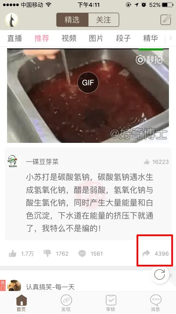
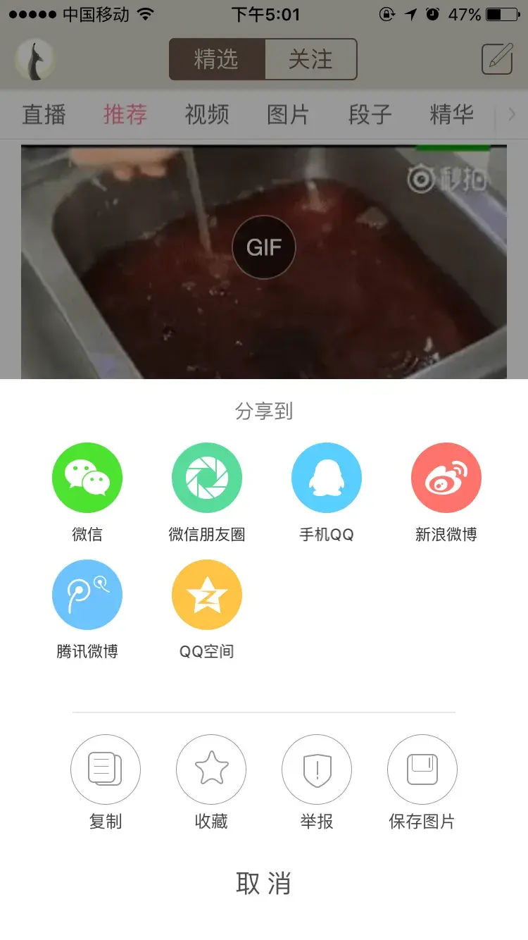
Once the panel is open, attention, shaped by that goal, stays on the sharing functions, which leaves people blind to everything else. The function icons at the bottom also look very much like the iOS system style, which makes the blindness worse. (The image below is the panel after tapping; note the "Favorite" and "Save" functions at the bottom.)
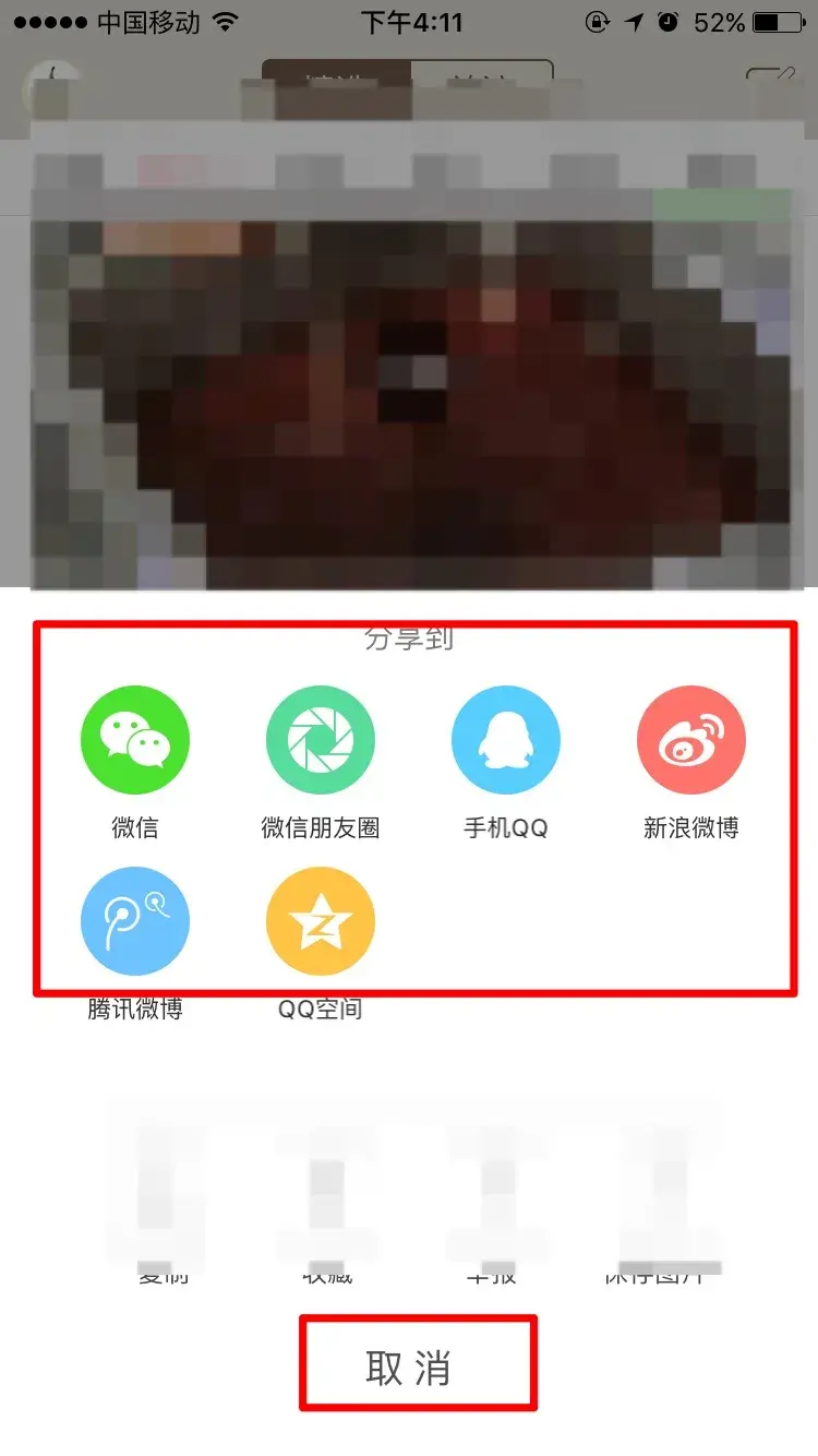
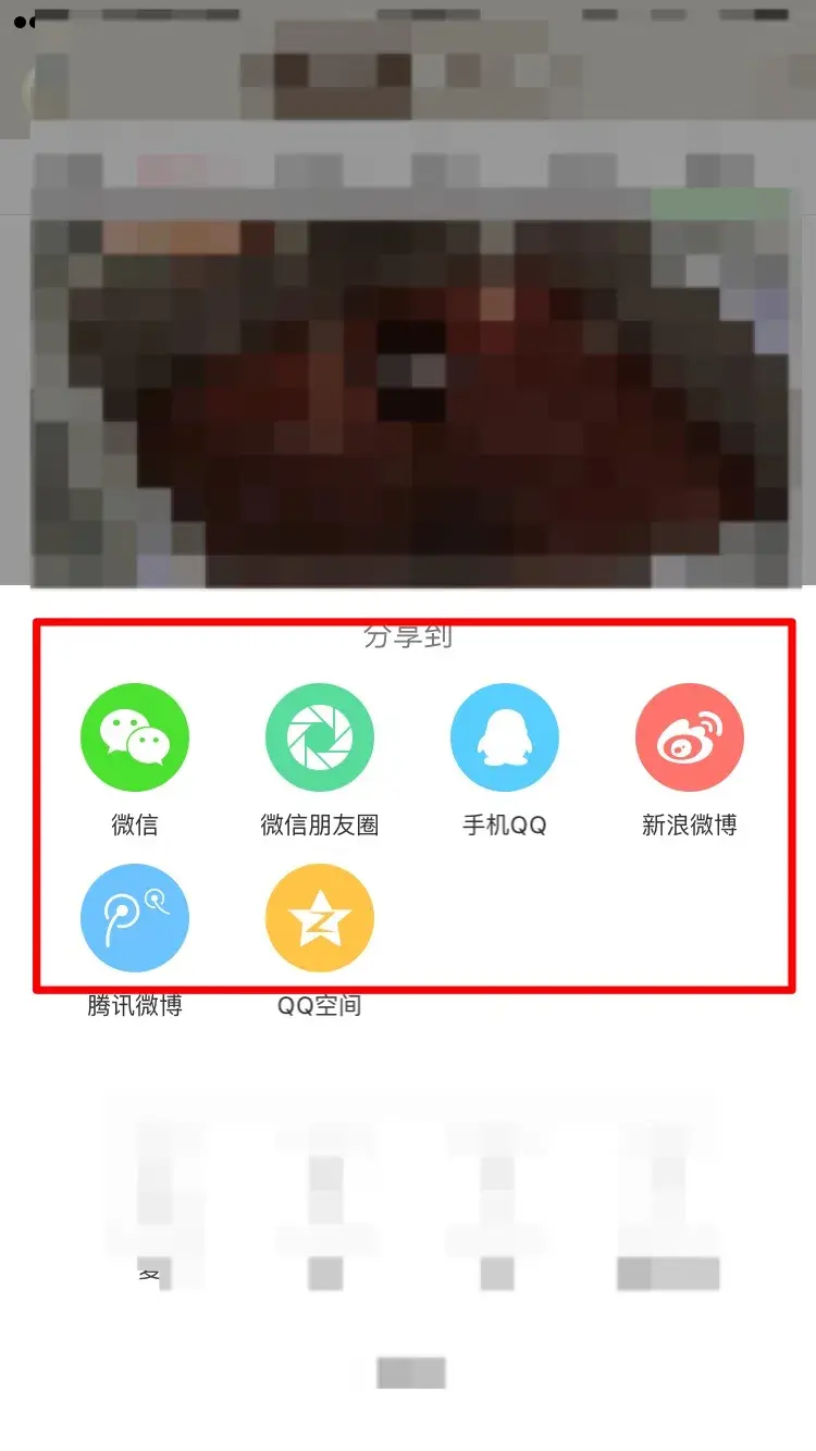
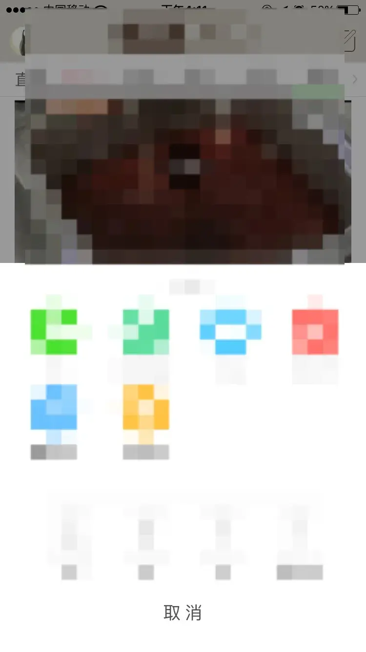
What the user actually sees is this (the user only sees two spots: the top one when sharing, and the bottom one when cancelling. The middle part usually gets a quick sweep of the eye and is ignored):
How to fix it
It's actually simple. There are two directions:
- Replace the share icon with "…" (meaning more functions): for this icon, users expect several functions to choose from once it opens, so they will look through it more carefully.
- Keep the share icon for sharing only and split it out on its own (one icon, one function, as users expect), and put everything else under "…" (more functions).
Whichever direction you take, the style of the "Favorite", "Save" and other function icons needs to change so they don't look so close to the system's, ideally matching Neihan's own style.
For those who want to dig into the analysis, read on for the full version. It works mainly from a few theories of cognition and includes some quite interesting ideas from current cognitive psychology. Recommended.
The full analysis
Two questions (wish I could add a poll here)
- Have you ever noticed "Neihan Duanzi's Favorite and Save features"?
- If you have, how long after you started using the app did it take you to notice?
To describe the complete mental process of a user using Neihan Duanzi, I've included my own experience of using the app. If you're not interested, skip this section and go straight to the next major heading.
Background: my experience with the app
As of today I've been using the Neihan Duanzi app for about half a year. What puzzled me most was that sometimes I'd come across a picture or joke I really liked and wanted to save or favorite it, but couldn't find any feature for it.
As an engineer I consider myself very experienced with apps, yet I genuinely never found anything like that. In the end I could only guess the PM had left these two features out for some special reason. And to keep the jokes I liked, I had to share them straight to my own WeChat, as shown below (dumb, but I couldn't find a better way):

Today, at my first requirements meeting on Neihan, this question came back to me, so I asked the person in charge, and was told the "Favorite" and "Save" features do exist; I just hadn't found them. (Most people try to find something a few times without success, then basically give up and use some other workaround.)
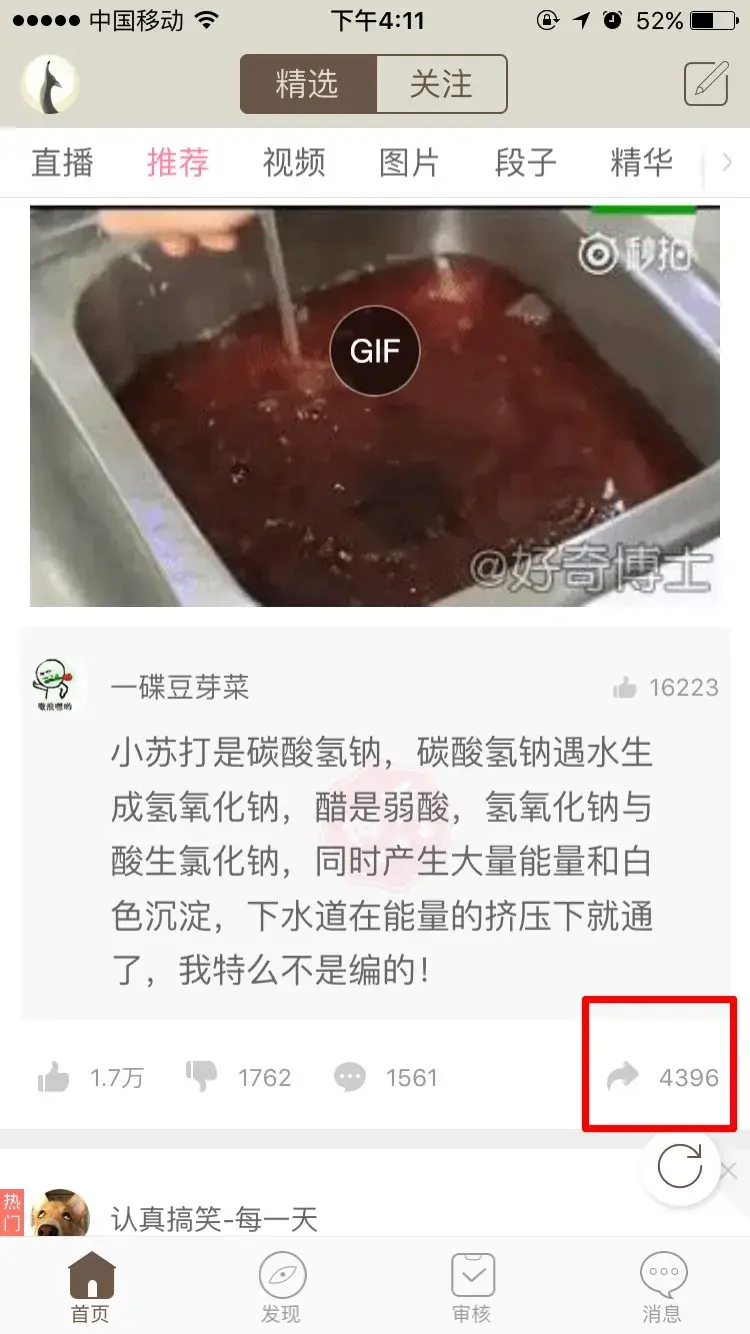
So I went through every icon I could see, one by one. Sure enough, I finally found a few features I had overlooked for nearly half a year. For some reason they had been invisible to me, even though I had tapped the share icon countless times. As shown below, Favorite and Save are right there at the bottom of the panel:
Why were "Favorite" and "Save" invisible?
The reasons can be found in cognitive psychology. In short there are four main ones (I won't expand on them, just the conclusions):
The area where our gaze is focused (central vision) is very narrow. At normal screen distance (half an arm to an arm's length), our point of focus is roughly the size of a thumbnail.
Human attention is very limited. When looking at a phone, an ordinary person can basically focus on only one point (usually the point of gaze).
Attention is easily guided by goals. Things strongly related to the goal get noticed easily; the rest tends to be ignored.
How we perceive things is shaped by experience and habit.
Step-by-step analysis
Tapping the share icon
The share icon:
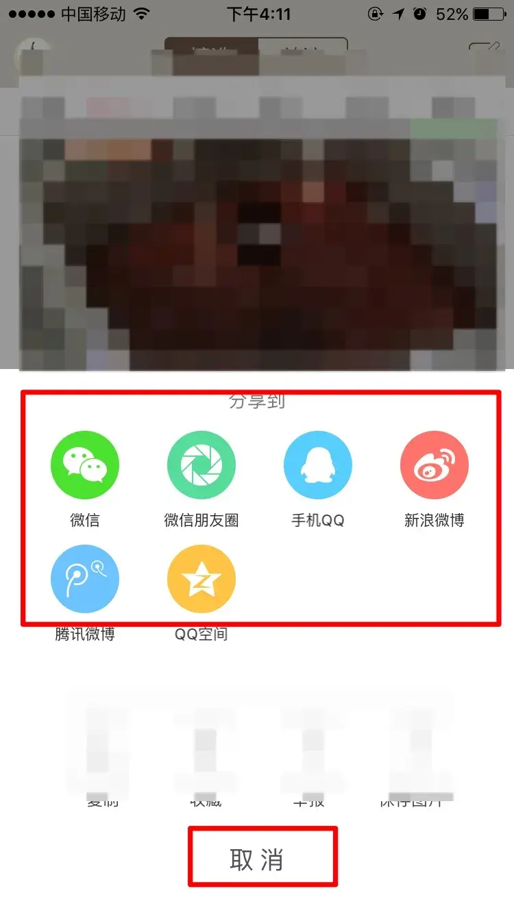
Anyone with experience of internet products knows this icon well, and usually taps it only when they want to share. Note the causality here: people generally don't tap the icon first and then decide whether to share. They come with the purpose from the start.
The share icon is so common that it sets up a strong representation (and a strong cue): the icon is the function. For experienced internet users, the share icon and the share function map one to one. (If functions other than sharing show up, that goes against what users expect.)
Taken together, these two points determine what users expect when tapping this icon: they're heading for sharing, and they expect to see sharing functions on the next screen (points 3 and 4 of the cognitive theory above).
Entering the share panel
The function panel:
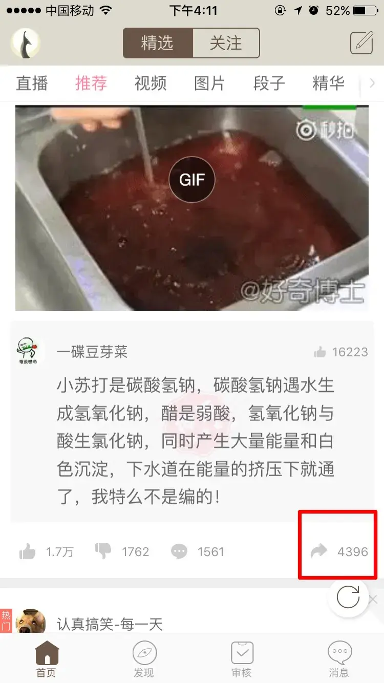
Once in the share panel, because the user already has a goal and expectation and is shaped by them, their gaze and attention look like this (per the theory above, the user's point of focus is small, and it only lands on what most deserves attention), as below:
If the user decides not to share after all, habit sends their eyes straight to the bottom. Their gaze and attention at that moment look like this:
Another reason for the blindness
The Toutiao share panel && the Neihan share panel
Toutiao (ByteDance's news app):
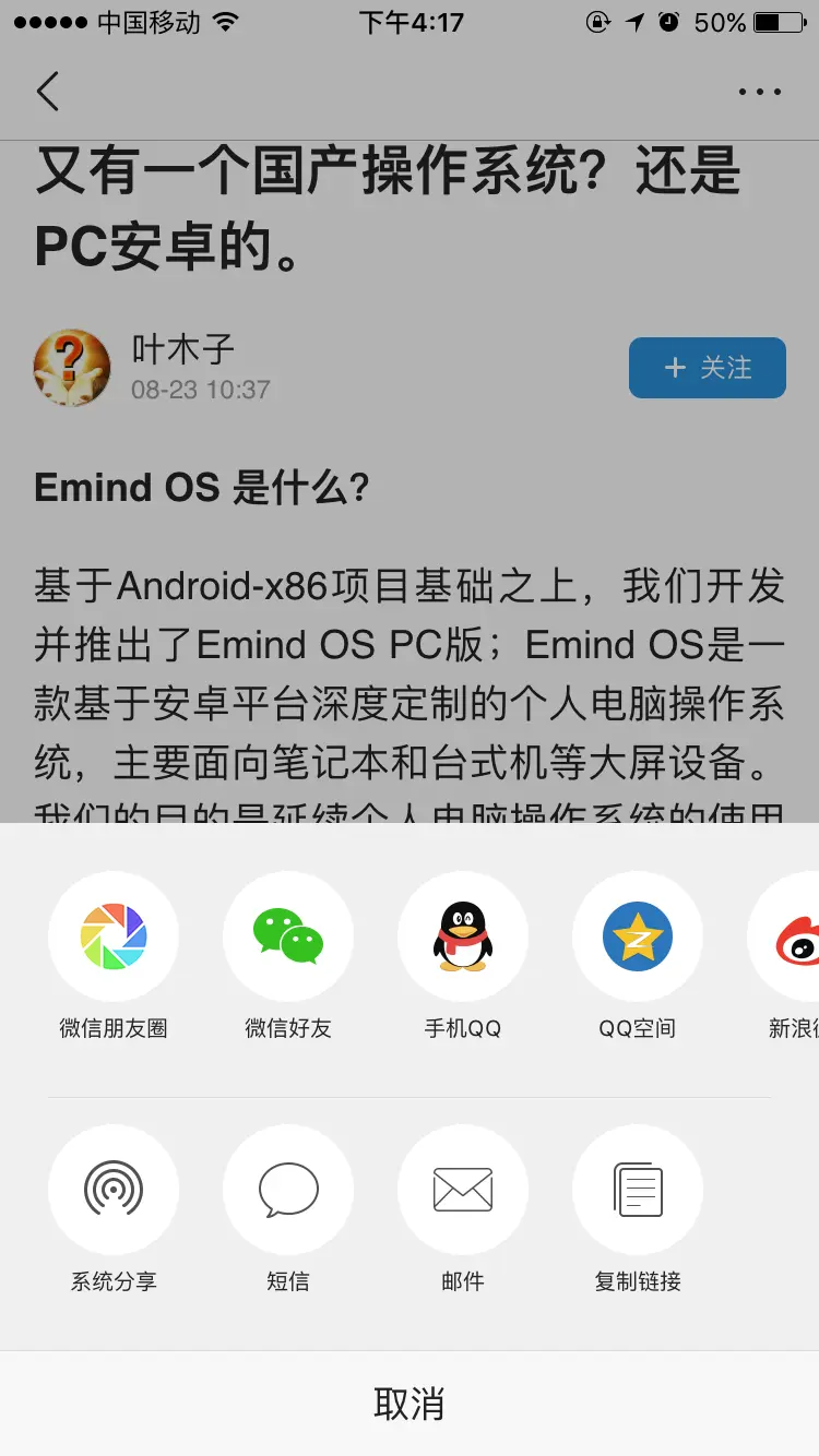
Neihan:
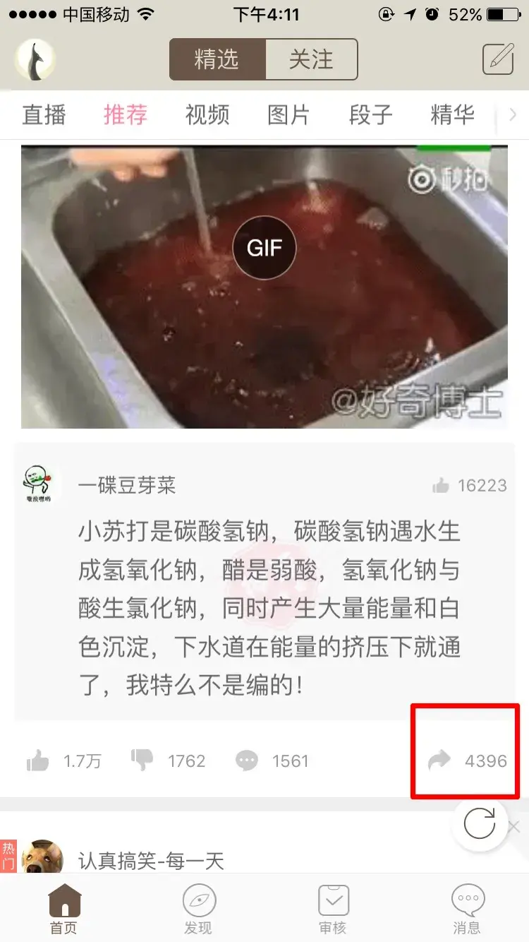
Comparing the two, you can see that the buttons in the lower part of Neihan's share panel are styled very much like iOS, and this style uses light-gray line icons with very low visual salience (hard for peripheral vision to pick up). Drawing on their own experience of iOS, users subconsciously assume this part is just a bunch of miscellaneous built-in system functions, so their eyes sweep straight past it and the information is lost.
How to fix it
It's actually simple. There are two directions:
Replace the share icon with "…", meaning more functions, because for this icon users expect several functions inside once it opens, so they will look through it more carefully.
Keep the share icon for sharing only and split it out on its own (one icon, one function, as users expect), and put everything else under "…" (more functions).
Whichever direction you take, the style of the "Favorite", "Save" and other function icons needs to change so they don't look so close to the system's, ideally matching Neihan's own style.

We meet by chance in this world.
I’m XingHua — glad to meet you.