
material design
—— bringing science into art, so that people without much experience can still make decent designs
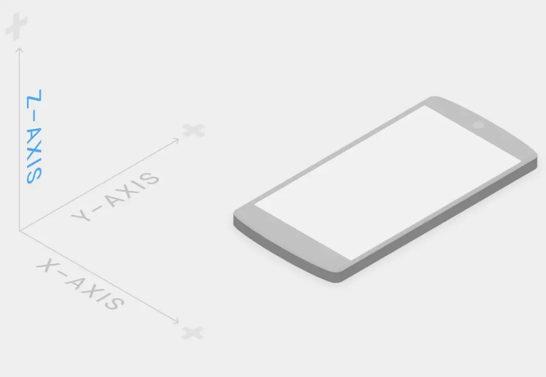
Introduction
The most accurate description is the official introduction1:
We challenged ourselves to create a visual language for our users that synthesizes the classic principles of good design with the innovation and possibility of technology and science. This is material design.
Develop a single underlying system that allows for a unified experience across platforms and device sizes. Mobile precepts are fundamental, but touch, voice, mouse, and keyboard are all first-class input methods
Design principles
Material is a metaphor:
This metaphor is the foundation for understanding everything else in material design. Whenever you think about the material design space and about how a whole series of elements should move and behave, don't forget the metaphor behind it.Bold, graphic, intentional (that is, the design is arranged in advance; there is a deliberate motive behind it)
It borrows the conventions of traditional print graphic design (typography, grids, space, scale, color, use of imagery) to guide visual treatment. These conventions don't just please the eye; they also serve to build hierarchy, convey meaning and direct focus (mostly in the sense of cognitive psychology, which I'll come to later).Motion provides meaning
Animation is a very important part of front-end interaction, but material design doesn't use it arbitrarily. Its motion is abstracted from reality and matches users' cognitive patterns.
Below I'll unpack this official summary.
The "science and technology" behind Material Design
Drawing on traditional graphic design
The official introduction says material design "synthesizes the classic principles of good design with the innovation and possibility of technology and science." The "classic principles" part is easy to understand. Back in the age of print, people had already explored a great deal about how to present information in forms that are more pleasing and easier to take in, and had distilled a number of graphic design principles that work:
- Consistency
- Reducing memory load
- Alignment, proximity
- …
These guidelines, originally for traditional paper media, were carried over to the new electronic media with very good results. Keep in mind that early web pages, apart from a few hyperlinks, came nowhere near the richness of presentation in print. Ideas from traditional graphic design gave web design very useful guidance, the grid system for example:
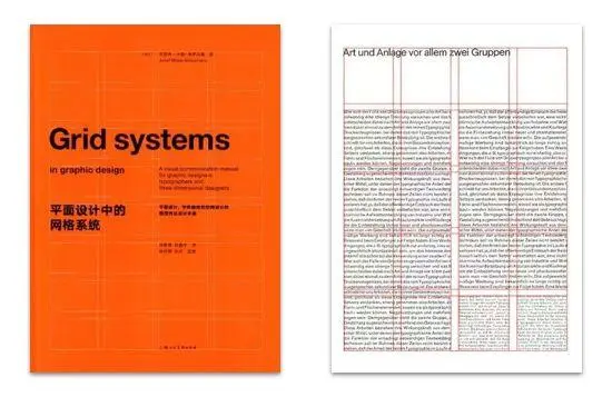
As the web developed, electronic media acquired something of their own. They were no longer purely static like paper; they had real "interaction." The web's new features needed other theoretical support. If we can no longer borrow from traditional graphic design, how do we create a set of design guidelines suited to these new web features? This is where the material design docs' "innovation and possibility of technology and science" comes in.
Opening up new design territory
If traditional graphic design can't be borrowed directly, look at whether there is something behind graphic design worth digging into. When looking for theoretical support, you need to search deeper in the reductionist direction. Roughly, that direction goes like this:
Design rests on psychology
Psychology rests on biology
Biology rests on chemistry
Chemistry rests on physics
These sweeping propositions are highly contested, but within these disciplines you can at least say they are "partly true." Digging deeper for design basically takes you as far as psychology and biology. Finding deeper theory gives a foundation for "creative" design. It lets the expression of the design space change, so you're no longer confined to transplanting traditional graphic design onto the new web medium; you can improvise freely from these deeper theories and create design forms suited to the web.
All that said, what exactly are these innovations and possibilities of technology and science?
Cognitive psychology
Before talking about cognitive psychology, here's a small example from Toutiao Quan (a social feature in the Toutiao news app):
This small example shows, to some extent, that cognition matters in front-end interfaces far more than people imagine, though many people don't realize how important it is.
The way humans come to know things (perception, learning, reasoning, memory and so on) follows certain fixed patterns, and people's cognitive behavior in front-end interfaces doesn't escape them. These patterns are formed by human biology. Since the Industrial Revolution, humans and their environment have been rapidly transformed, but evolution works on a scale of millions of years. The evolution of human biology was essentially finished long ago, and for the foreseeable future that biology will stay stable. Psychology already has quite a few findings that can teach design something:
- How experience, environment and goals affect cognition
- Gestalt phenomena in perception
- Short-term and long-term memory
- Research on reading behavior
- The psychology of decision-making
- …
All of the research listed above has applications in design. As for why we should talk about cognitive psychology at all, Designing with the Mind in Mind has a passage on it (slightly edited and expanded):
Following user-interface design guidelines isn't as step-by-step as following a cooking recipe. Design guidelines often describe goals rather than actions. They are deliberately very general so that they apply broadly, but that also means people often interpret their precise meaning, and how they apply to a specific design situation, in different ways.
To complicate things further, for any one design situation, several rules often seem to apply at once. That requires trade-offs between designs, and those trade-offs can't rest on the designer's personal taste alone; they need data and theory behind them. Data can come from the operations team.
Theory, though, can only come from the deeper level of cognitive psychology.
If you understand users' cognitive patterns, you're less likely to end up with something that "follows the design principles but doesn't match how users think," which makes for a bad user experience. In the example above, decorating the "…" follows quite a few design rules: it's more consistent, fits better with the other icons, stands out more, and so on. But it doesn't match cognition, and users easily make mistakes there.
Humans live in the physical world, while their minds sometimes roam the internet. This creates a "context switch" between the physical environment and the internet environment: people understand things on the internet through certain features of the real world, the trash can standing for the recycle bin, for example. With the help of psychology, we can make the cognitive transition from reality to internet design fairly smooth. The same goes for motion. Motion in the real world is smooth; nothing moves in broken lines (collisions aside). That's why smooth transitions look natural, and because of that naturalness they feel familiar and are more readily accepted.
Another place where a "context switch" happens is moving between scenes within an app. Transition animations need careful design to guide the eye, so that the transition feels natural and smooth and the user's train of thought doesn't break. This is where Bézier curves come into their own.

Biology
This is mainly research into the characteristics of biological structure, where cognitive psychology can look for its theoretical foundation, for example:
- Neuroscience
- Eye-tracking research
- Research on how the eye forms images
- This research is more fundamental and touches on evolutionary theory to some extent, so I won't go into it here. Here's one piece of theory about the eye's photoreceptor cells:
The spatial resolution of human vision drops sharply from the center to the periphery, for three reasons:
Pixel density
Each eye has 6 to 7 million cone cells, and they are packed far more densely in the center of the visual field (a tiny region called the fovea) than at the edges (corresponding to central vision). The fovea has about 158,000 cones per square millimeter, while the rest of the retina has only 9,000 cones per square millimeter (corresponding to peripheral vision).Data compression
The fovea's cones connect 1:1 to ganglion cells, the starting point for processing and transmitting visual information, while in the rest of the retina several photoreceptors (cones and rods) connect to a single ganglion cell. In technical terms, peripheral visual information is compressed (lossily) before it reaches the brain, while central vision is not.Processing resources
The fovea makes up only about 1% of the retina, yet 50% of the visual cortex is devoted to input from the fovea, and the other half processes data from the remaining 99% of the retina.As a result, visual resolution at the center of our visual field is far higher than anywhere else. At arm's length, the fovea's field covers roughly the area of a thumbnail, about the width of three characters on the screen you're reading now. This is the basis of visual focus.
—— Jeff Johnson, Designing with the Mind in Mind (quotation slightly adapted)
Biological research on the eye tells us that when people look at a screen, their visual focus is basically only the size of a thumbnail; everything outside it is "peripheral vision." Given this mode of vision, how to guide the eye and draw users' attention to the information you want them to see is a real challenge. The most direct example is where and how an error message appears when an input field has an error.

Other things
Abstraction from physics && sensible quantification
The official material introduction also says "material is metaphor". Material is a metaphor. A metaphor for what?
What material design metaphorically refers to is a design material. Let's call it the "material card." It is abstracted from reality, stripped of reality's impurities and randomness, keeping spatial relationships, change and transition, and light and shadow. This material has thickness, and pieces of it have spatial relationships with one another. This actually hints at a bigger metaphor: the whole of material design stands for a particular design space, a space with three-dimensional structure, and material cards are the basic material it is built from.
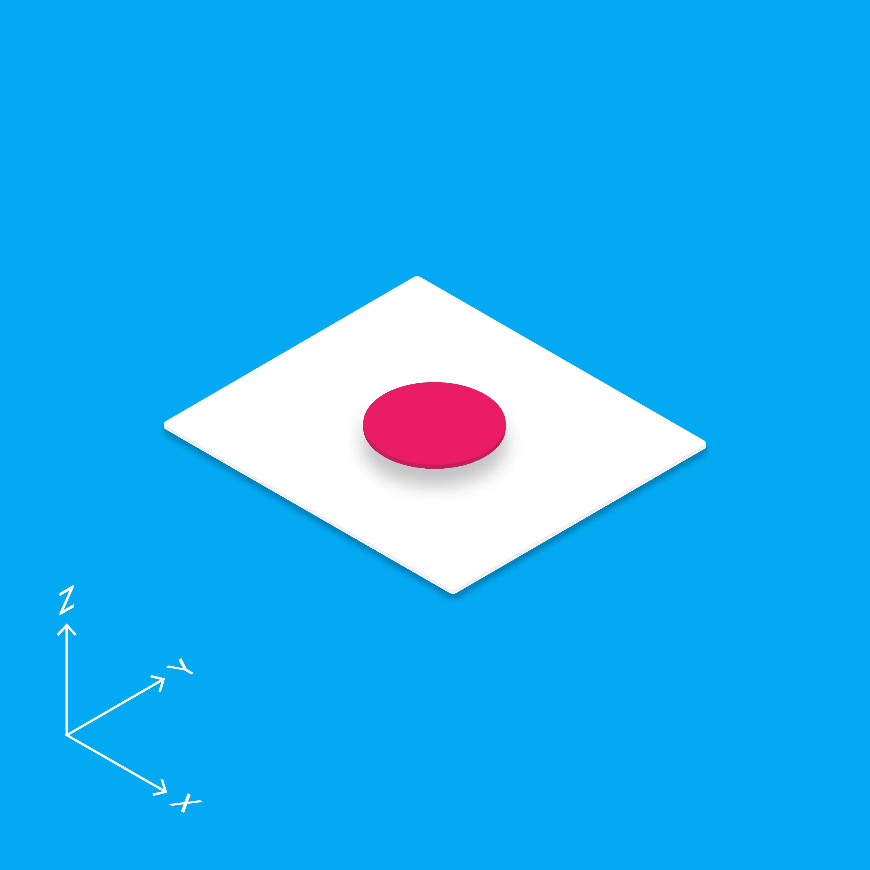
Why go to so much trouble to abstract a design material and a virtual space?
Because materials, together with the rules for building with them, determine consistency
To understand this, we can start from architecture in the real world:

All design can be vividly described as "dancing in shackles," and this is especially obvious in architecture. Real-world architecture requires using basic available materials (brick, concrete, steel, glass) to produce designs that obey the physical laws of the real world.
Keep in mind that most buildings in the world are much alike. Only a few architects can design buildings that both obey the rules and rise above the ordinary.
If the materials and rules are too restrictive, the result is rigid expression. Although material design is abstracted from the real world, it also adds magical properties that don't exist in reality: material design cards can be freely split apart, merged, transformed and so on.
MD has some quantitative standards, and they provide design with a stronger layer of regulation:
- Card thickness
- Card elevation differences
- Color choices
- Animation timing
- The longest gap between successive images that still lets them fuse visually: 20ms
- The lag between a visual event and our complete perception of it: 100ms
- The editing "window" for an event to enter consciousness: 250ms
- …
This idea of "quantified design with a basis" is ahead of its time. It means design no longer belongs exclusively to masters with rich experience, and is no longer just bursts of inspiration and the expression of personal taste. If you know some history of science, you'll see why this act of "bringing science into design" at the level of design language matters. To draw a comparison: it is like bringing quantitative, scientific method into alchemy, which had always been practiced in mysterious ways, and it became chemistry.
Traces of combining science and technology can be seen in earlier design too, but none of them reformed and regulated design as thoroughly as material design does, through the form of a metaphorical space.
These features can be said to be why "people without much experience can still make decent designs."
People without much experience can still make decent designs?
What is decent design
- Visually beautiful
- Helps convey information precisely
- Grounded in psychology and matched to users' cognitive habits (not just the designer's personal taste)
- Material design has already built all of the above into its basic vocabulary, so doing front-end design with material design to some extent sets its floor: it won't be terrible.
Material Design tries to find a design point between art and science. That is possible, although it demands a great deal of the designer.
In my view, Material Design has partly achieved this. Its thinking is very clear and highly inspiring. Even if Material Design as a whole dissolves one day, many of its most inspiring ideas will carry on.
A Material Design mind map
The mind map above was compiled from the Material Design guidelines. The branches on the right describe Material Design's most basic components and structures. The branches on the left introduce some empirical best practices. Using what I've described above, readers can see whether they can find traces of these principles and techniques behind them.
References
Links:
material design official site
How should we understand Google's Material Design language? (Zhihu, Chinese)
The Verge's interview with Matias Duarte
Books
Grid Systems in Graphic Design
Designing with the Mind in Mind: Simple Guide to Understanding User Interface Design Guidelines
Don't Make Me Think
- This is the original material design website; by 2024 it had moved on to M3 ↩

We meet by chance in this world.
I’m XingHua — glad to meet you.